Problem
User Engagement Challenge: UX/UI Gaps
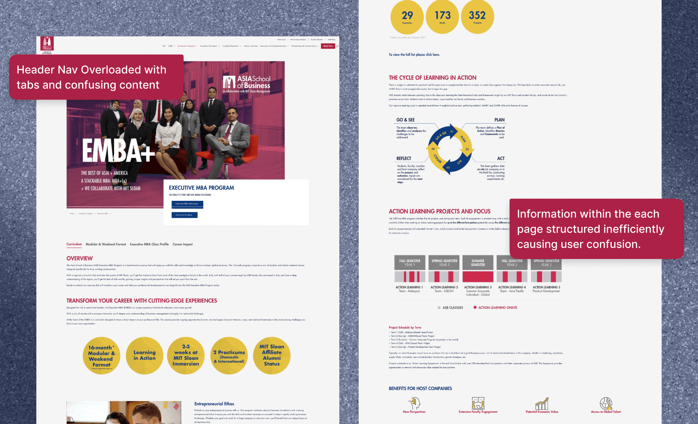
The ASB website faces a user engagement and conversion challenge tied to UX/UI gaps.
Accumulated content and evolving needs have left the interface less user-friendly, leading to high bounce rates, reduced conversions, unclear user experience, and payment glitches.
Navigational Confusion: Diverse User Issue
With ASB's growing audience spanning various professional segments, the website required adaptation. The original MBA-focused content fell short in catering to this broader demographic.
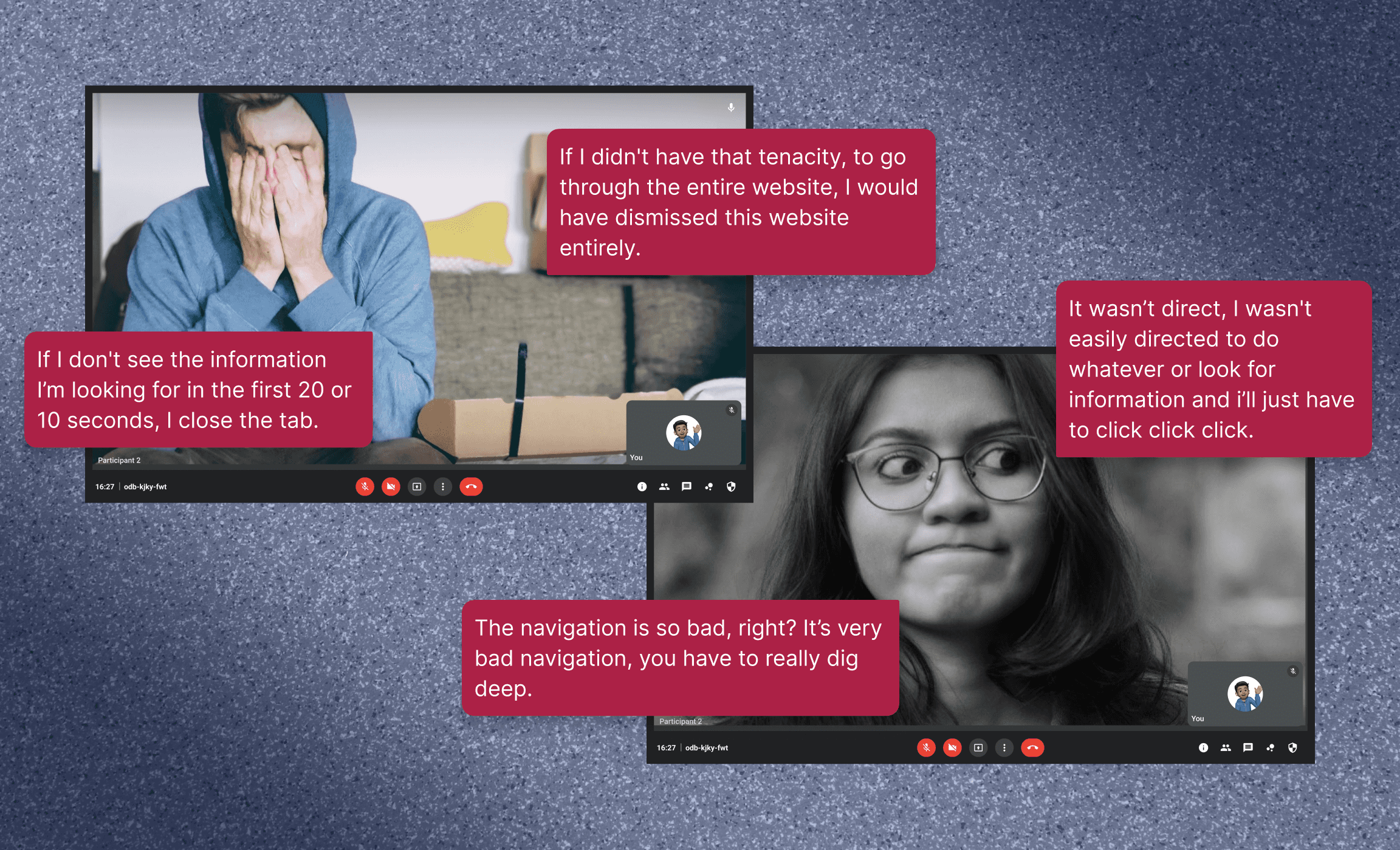
Further exacerbated by a perplexing website structure, users encountered hurdles in seamless navigation. This navigation issue hampered content discovery and hindered communication with ASB.
Research
The research phase was pivotal, allowing me to delve into ASB's ecosystem. Engaging with stakeholders and students offered a personal glimpse into their needs and pain points. These conversations fuelled the project with a human touch, shaping our approach in a meaningful way.
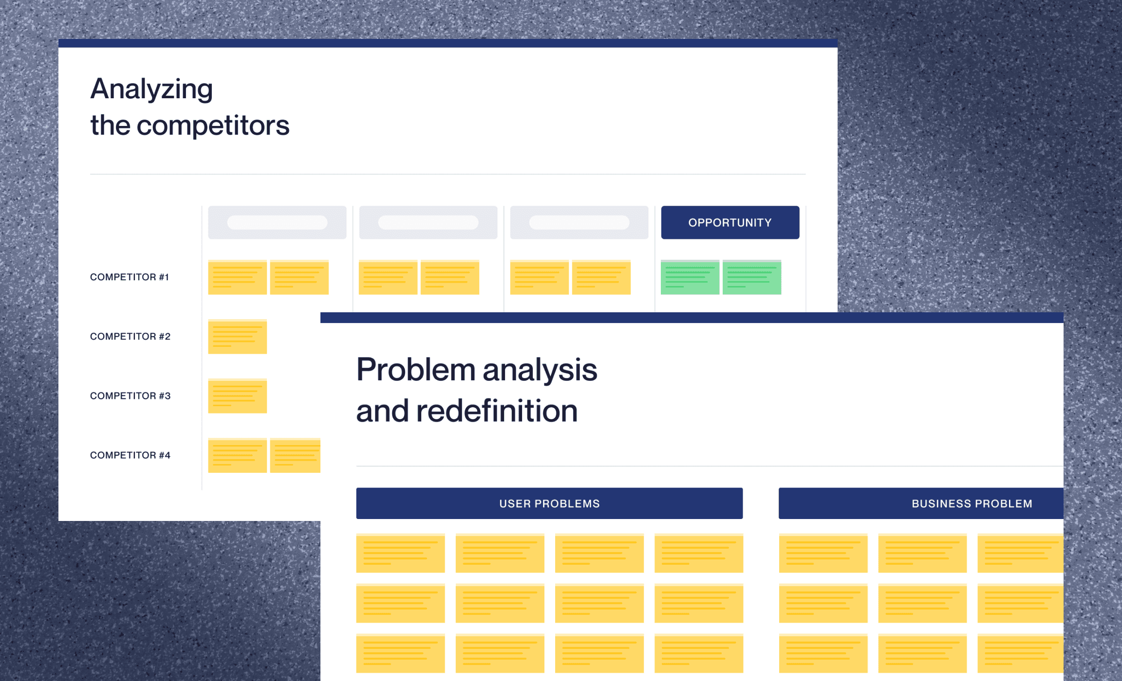
Furthermore, a competitor analysis illuminated industry trends that couldn't be ignored. This information became a compass, guiding our solutions while keeping ASB's uniqueness intact. These insights weren't mere statistics—they breathed life into our redesign strategy.
Solution
Solving the Information Overload Problem :
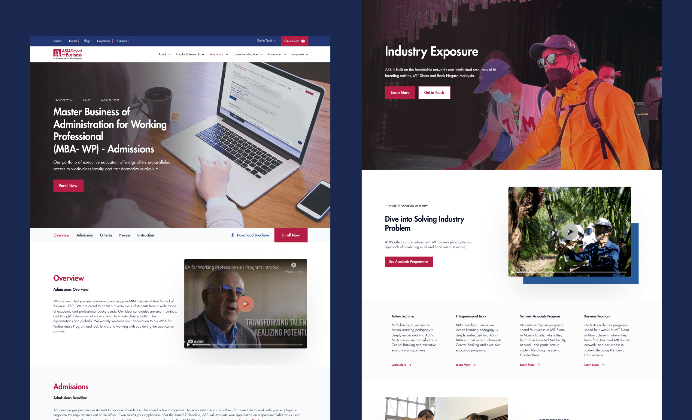
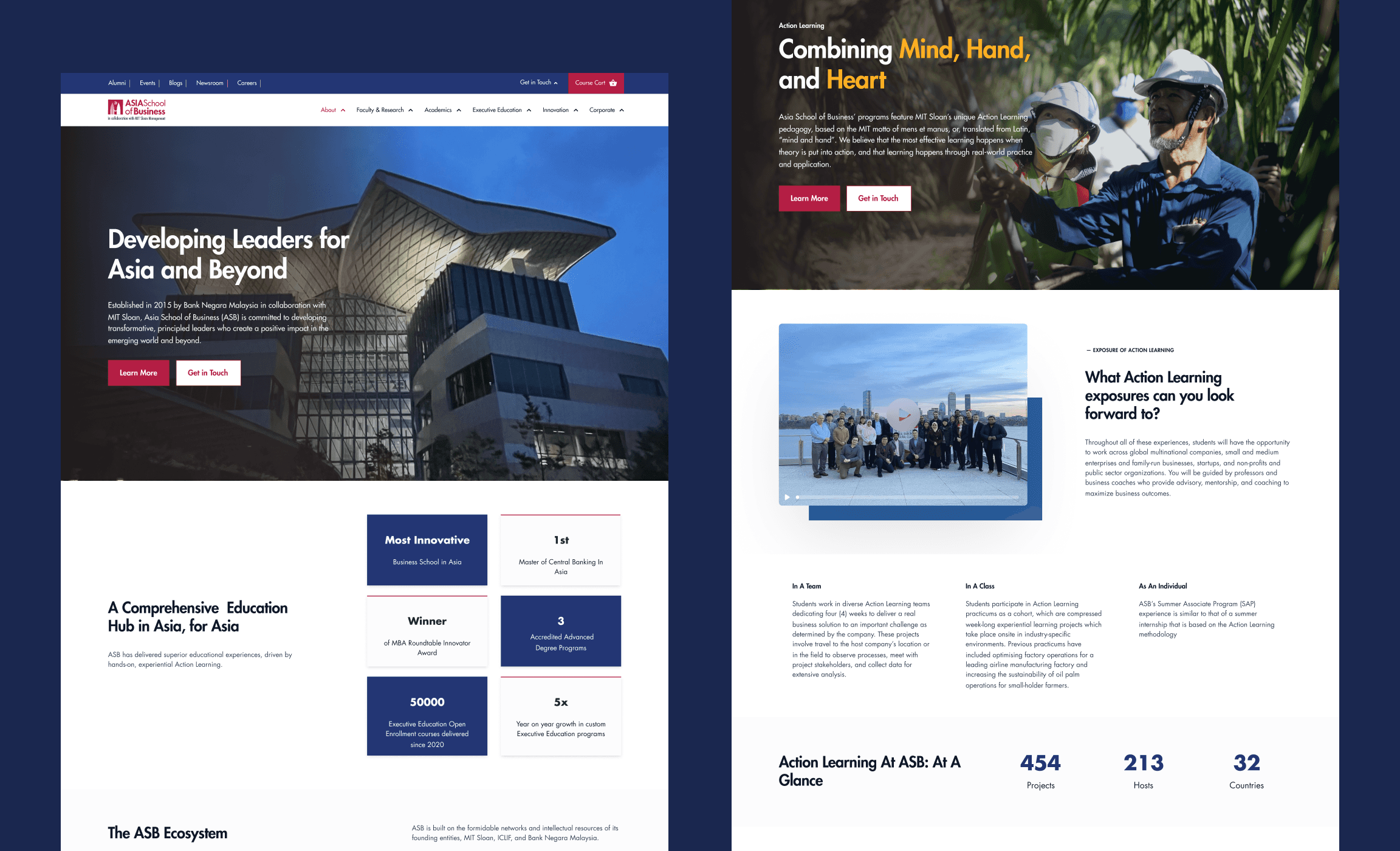
I confronted the challenge of information overload head-on. Recognising that users often struggled with dense content, I restructured the website's information into easily digestible sections, complemented by intuitive icons.
My primary goal was to spotlight critical details, especially on program and course pages, where user decisions were pivotal. By optimising the content layout, I aimed to simplify information retrieval, resulting in a noticeable boost in user engagement and conversion rates.
Streamlining Navigation & Contact Function:
In response to user confusion caused by ineffective content arrangement, I introduced solutions to streamline navigation and enhance contact functionalities.
Revitalising the parent header and introducing a dynamic header within pages, I ensured seamless website exploration. I strategically positioned clear, prominent calls-to-action above the fold, guaranteeing their visibility and accessibility to users interested in signing up or seeking information.
These changes were meticulously designed to elevate user experience, streamline navigation, and ultimately drive increased engagement and conversions.
Results
83% Success Rate on User Tests
30+ Pages Designed
100+ interactions on a fully functioning prototype
Conclusion
This venture wasn't just about design; it was a learning curve. Overcoming ASB's digital challenges expanded my skills.
The redesign positive impact on engagement and conversions is promising as we received positive feedback from testers.

